How To Create Excel Dashboard Widgets
Creating a dashboard in Excel can be quite simple –it's really just a matter of downloading the right data and some easy formatting techniques. Layout is your challenge, but even that can be overcome.
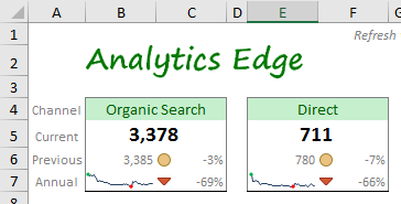
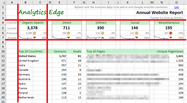
Before you begin, make sure to plan out your whole report. There is nothing worse than spending a lot of time preparing a dashboard only to discover that the data you need to show at the bottom won't fit in the layout you've used at the top of the page. Remember that Excel uses rows and columns, and the row height and column width are constant across the entire page (see Building a Marketing Dashboard for other considerations). Consider using a different worksheet and the Camera tool (see below) to put an image of the widget in your report.
The Widget Details
The classic dashboard widget includes a main metric, sometimes referred to as a key performance indicator (KPI). Since context is critical for any report, the number is usually presented with a comparison to the previous period; in this case, we show both the previous value as well as a percentage change from the previous period to the current period. To provide even more context, a small annual trend curve (sparkline) is shown with the percentage change from the same period in the previous year.
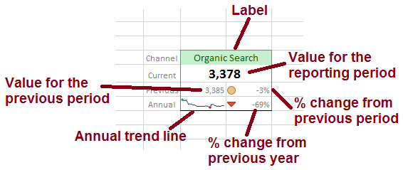
The Data Behind the Widget
Reviewing each element in the widget, we see that we need the following data:
- value for the current period (top number displayed)
- value for the previous period (displayed as a number and used to calculate the % change)
- values for each of the periods over the past year (shown as an annual trend line)
- value for the same period in the previous year (used to calculate the % change)
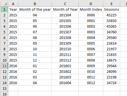
Using Analytics Edge, we can automate the download of the data, and in this example I will get Google Analytics website traffic data. While we could grab each piece of data in a separate query, you may realize that a single query can get everything you need: an annual query + 1 reporting period (as shown below). For example, if you wanted a monthly report, pulling monthly values for the last 13 months (1 year + 1 month) would get you everything you need:
- the current period (most recent period)
- the previous period (next one up the list)
- an annual trend (the last 12 months of numbers)
- last year's number (the oldest value in the list)
Note about sampling: while 13-month queries like this are technically subject to data sampling errors for Google Analytics, top level metrics like Sessions are supplied from pre-calculated values. If you use a segment or filter, select the option to Minimize sampling.
Building the Query in Analytics Edge
I strongly recommend that you place all query results on a Data worksheet and use Excel cell references to your dashboard worksheet. This provides some flexibility later when things change (which they always do), and will save you from tons of work caused by doing something as simple as inserting a row or column.
When building queries with time dimensions, like date, week or month, be careful which dimensions you chose. Using month as an example, you can use the 'Month of the year' dimension, which is just a 2-digit month number. The problem with this dimension is that it will not appear in the proper time sequence when sorted ( Jan 2020 [01] would sort before Dec 2019 [12]). To avoid this problem, you could:
- include the 'Year' dimension in the query, sorted by 'Year' then by 'Month'
- use the combination dimension 'Month of Year'
- use the normalized 'Month Index' dimension
My preference is the combination dimension 'Month of Year', because it is easier to sort and provides instant validation about what time period the data represents.
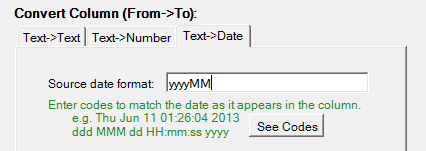
Note: Although not needed in this widget example, with the Analytics Edge Core Add-in, you can use the Convert function to convert this text column into Excel dates using the date format 'yyyyMM'.
Formulas and Charts
All that is left is to tie the numbers back to the widget using some simple Excel formulas. The current and previous period measures are simple Excel cell references. The percentage change calculations follow the formula of =(current value-previous value)/(previous value). You can use a simple sparkline chart for the trend curve. Example formulas are shown in the image below.

Presentation Tricks
Of course, you can't send your boss plain old black numbers on a white grid. A little bit of Excel formatting 'magic' will make things much more presentable to others. Here are the things I typically do:
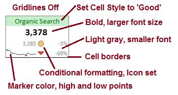
- first, turn off the gridlines to give the dashboard a cleaner look
- use simple Excel Cell Styles to change title background and font colors, or choose your own to match your corporate color palette
- make the current period number stand out (larger, bold) and de-emphasize the other numbers (smaller, light gray)
- put a border around your widget to visually group all the elements as related items
- add conditional formatting on the percentage change numbers for visual reinforcement of the direction of change (note: change the thresholds to above/near/below zero)
- add high and low points to the sparkline charts to make it easier to determine where they might be on those tiny lines
Formatting your dashboard can be extremely time consuming if you let it. It is easier/faster to do all of the formatting at once, so get all your numbers in place first, then format the whole worksheet. I have found over the years that it helps to review your draft report unformatted if possible (or at least all in black and white) to avoid wasting time discussing colors and font sizes, and keep the discussion on the metrics themselves. Once you have all the numbers you want, you can then decide how to format it and what you want to emphasize.
Consider the 'Story' you want to tell with the report — too many reports simply show data without purpose, and those reports have little value to the recipient. Make sure the formatting emphasizes the message you want to send.
Camera Tool: Take a Picture and Put it Anywhere
Creating widgets in the way described above means that the column and row sizes MUST be fixed, and that puts severe constraints on what else you can show in a dashboard report. Using Excel's Camera tool allows you to take a picture of your new widget and place the picture on your dashboard — update the data, and the picture refreshes! Note: some people don't like the quality of the image, especially if you print it. Try it for yourself.
How To Create Excel Dashboard Widgets
Source: https://help.analyticsedge.com/article/creating-an-excel-dashboard-widget/
Posted by: davisbantais.blogspot.com

0 Response to "How To Create Excel Dashboard Widgets"
Post a Comment