How To Create A Timeline Chart In Google Sheets
Creating Chart is easy if you know how to format your data to use as the source data in Chart. So here is one example of annotated timeline chart in Google Sheets. But in my testing, the annotation part does not seem working. I'll come to that later.
Update: The annotation started appearing.
Introduction to Google Sheets Annotated Timeline Chart
Annotated Timeline chart is part of Google Sheets and it's similar to the popular Line Chart. This chart is useful to show an interactive time series line chart in Google Sheets. This interactive time series is the difference between an Annotated Timeline Chart and Line Chart.
Timeline Chart and Annotated Timeline Chart are two different chart types. A Timeline Chart normally refers to a Gantt Chart.
There is no inbuilt Timeline Chart (Gantt Chart) feature in Google Sheets. But there are workarounds.
You can use Stacked Bar Chart as a very basic Gantt Chart in Google Sheets. Also, you can use some custom formulas to create a Gantt Chart. That involves conditional formatting.
If you want a fully flexible Timeline (Gantt) Chart, I recommend you to try one of the popular online Project Management Software called Wrike.
You May Also Like: Create Gantt Chart Using Wrike Online Project Management Software
Annotated Timeline Chart and Line Chart – A Quick Comparison
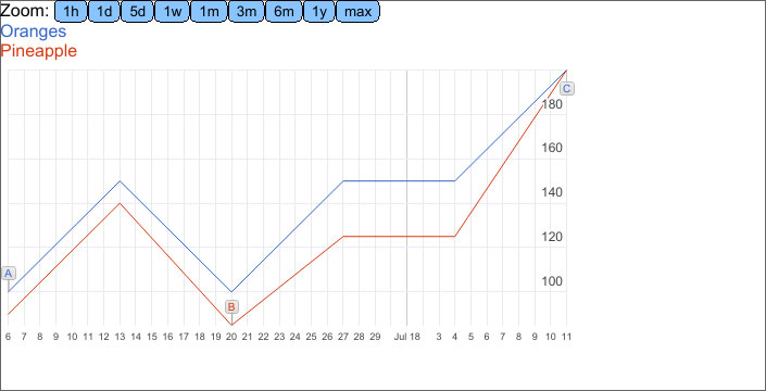
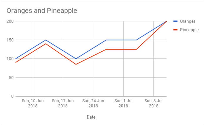
See the screenshot 1 and 2 below to understand the difference between an Annotated Timeline Chart and Line Chart.
Both these charts show the changes over short and long periods of time. You can show one or more lines in both these charts to compare.
In the below example I am comparing the sales of Oranges and Pineapples over a short span of period.
Annotated Timeline Chart
Screenshot 1:

Note: The issue of blank space instead of annotation on the Google Sheets timeline chart is now solved.
Line Chart
Screenshot 2:

As I've mentioned above, the core part of every graph in Spreadsheet applications is the well-formatted data. Let's see how to format data for Annotated Timeline Chart.
I have covered the formatting part under the below title.
Example to Annotated Timeline Chart in Google Sheets
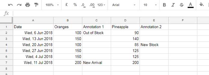
Here is the sample data that I've used to create the above Annotated Timeline graph.

How to Format Data for the Annotated Timeline Graph
There are five columns in the above sample data for the graph. Let me explain it one by one.
Column 1:
The first column should contain the Dates, which means the column type is "Date". It's the X-Axis Value in Chart.
Column 2:
The second column should contain numbers (Y-Axis) and it's for the data line.
Column 3 (optional):
The third column is for the annotations which are obviously string. It's optional. At present, it's not working. Google Sheets is not showing up the Annotations.
Column 4 and 5 (Optional):
If you want an additional data line you can add that also. In my above sample data, Column 4 represents an additional data line and column 5 is for its annotations.
Unfortunately, the annotation feature is turned off in Google Sheets. It may be a bug. But you can see it marked on the data line like A, B, C. Please refer to my Screenshot 1.
We have now the formatted data. Let's move to the next step, which is chart creation.
How to Create Annotated Timeline Chart in Google Sheets
From the above-formatted data, we can create an Annotated Timeline Chart in a flash.
Steps Involved:
1. Select the data range A1: E7.
2. Go to the menu Insert > Chart and select "Timeline Chart". That's all.
Now some of you may want to know how to format the above data for the Line chart. It's simple.
Just delete the columns that contain the annotations, i.e. Columns C and E. Then select the data and create a line chart from the Chart Editor.
Conclusion
The Annotated Timeline Chart in Google Sheets is interactive. You can zoom in the data line to particular intervals like 1 hour, 1 day, 5 days, 1 week, 1 month, quarter, 6 months, 1 year, and Max.
Try to learn this not-so-popular graph and I am sure that you will definitely replace some of your line charts with Annotated Timeline Charts. Enjoy.
How To Create A Timeline Chart In Google Sheets
Source: https://infoinspired.com/google-docs/spreadsheet/annotated-timeline-chart-in-google-sheets/
Posted by: davisbantais.blogspot.com

0 Response to "How To Create A Timeline Chart In Google Sheets"
Post a Comment